See what actually shows up, and how often
Memory is unreliable when you are in pain, and doctors ask “how often?”. Trends turns your daily logs into counts and charts: how bad, how often, what changed. Nothing here is inferred. It is your own entries, added up.
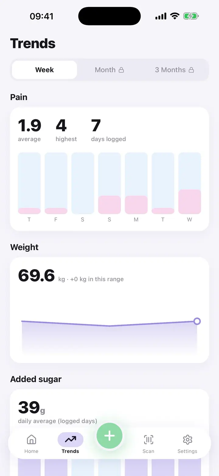
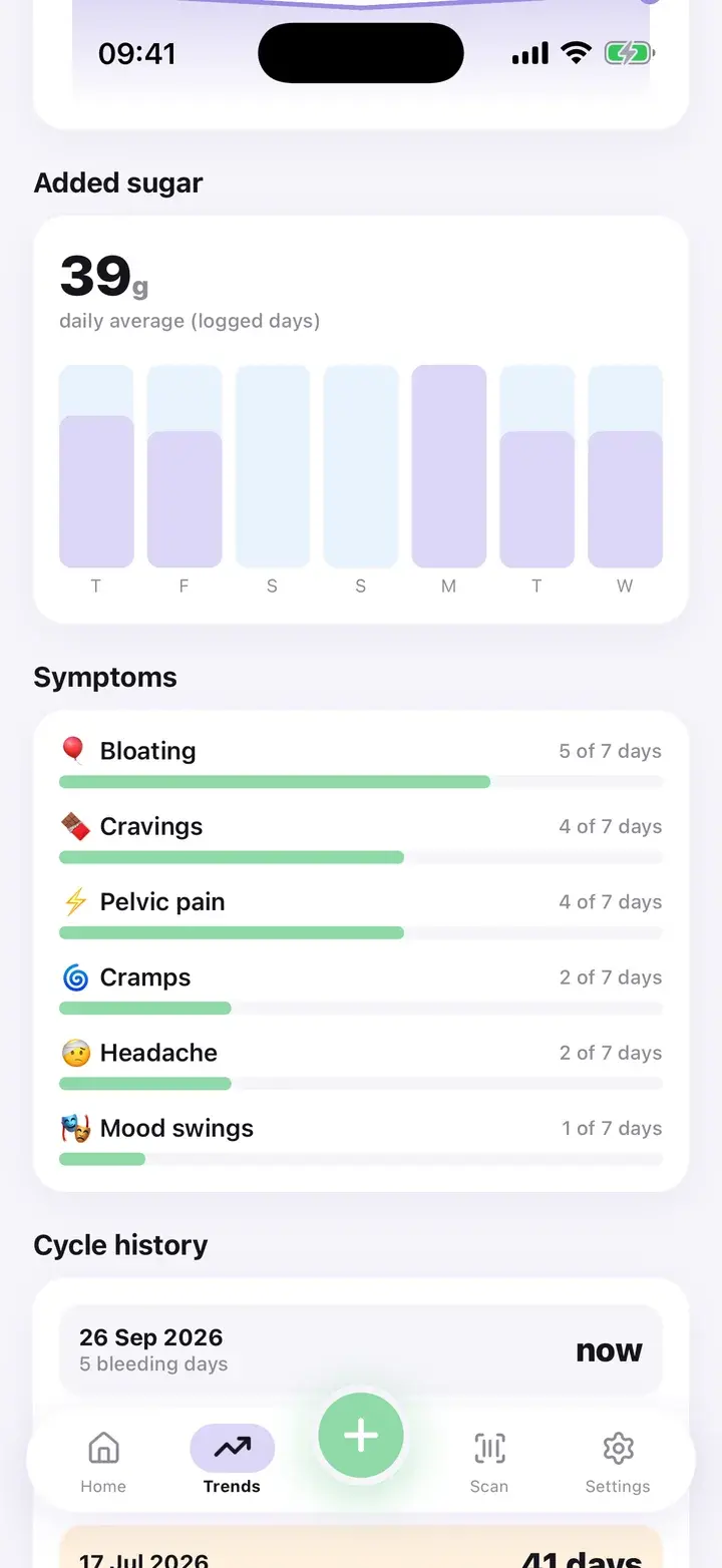
What each block shows
Pain: your average, your highest, and how many days you logged in the range, with a chart. Weight: a line over the range and the change in kg or lb. Added sugar: the average per day, from foods you added.
Symptoms: each symptom with the number of days it appeared out of the days in the range, for example “14 of 30 days”. That is the kind of figure a doctor can use, and it takes the guesswork out of “most days”.
Cycle history sits at the bottom of the same screen and has its own page on this site.
Counts out of the days in the range, not impressions.
Week, month, 3 months
A segmented control at the top switches the range. The last 7 days are free. The 1-month and 3-month ranges are part of Premium, and tapping them without Premium opens the paywall instead of showing a half-empty screen.
Everything on the screen, including the symptom counts and charts, is calculated on your phone from your logs.
Also on this screen
Share with your doctor
Two buttons at the bottom: the doctor report, and a monthly recap card to share as an image.
Honest empty states
With no data the screen says so, for example “Log symptoms and they’ll show up here”, instead of drawing a fake chart.
Insights are separate
Pattern insights are a Premium block further down this screen. They have their own page.
It shows frequency, not cause. A symptom appearing on 14 days of 30 does not say why. Insights add observations on top, worded as observations, never as advice.
Questions
Which ranges are free?
The last 7 days. One month and three months need Premium.
Can I export the data behind the charts?
Yes, as a CSV with Premium.
Why are some charts empty?
Weight and blood sugar are optional. A chart only appears if you have entered values in the range.
The screenshots on this page are from the real app, filled with sample entries made for this page. They are not anyone’s health data. Not a medical device. Updated October 7, 2026.